Rockhurst
Creating a trusted brand for a supercar dealership, where peace of mind lives alongside precision engineering.
Logo design
Visual identity
Illustration
Brand guidelines
Design for Print
Communications
Signage
Social media assets
Brief:
Rockhurst meticulously curate a selection of highly specified, rare, unique or bespoke performance vehicles – focused on the driver experience.
Discerning motoring enthusiasts are underserved by what is currently available. They face a market where passion often presides over professionalism, where the transaction is frequently more important than the relationship, or where quantity is prized over quality. Rockhurst sees a world where courteous service, appropriate finance and ongoing support are given the same consideration as vehicle specification and provenance.
Our challenge was to develop a trustworthy brand that talks to U/HNW audiences without appearing too luxurious. It was also necessary to communicate the client’s specialist technical knowledge and engineering expertise which – alongside their professionalism – would give them an edge.
Solution:
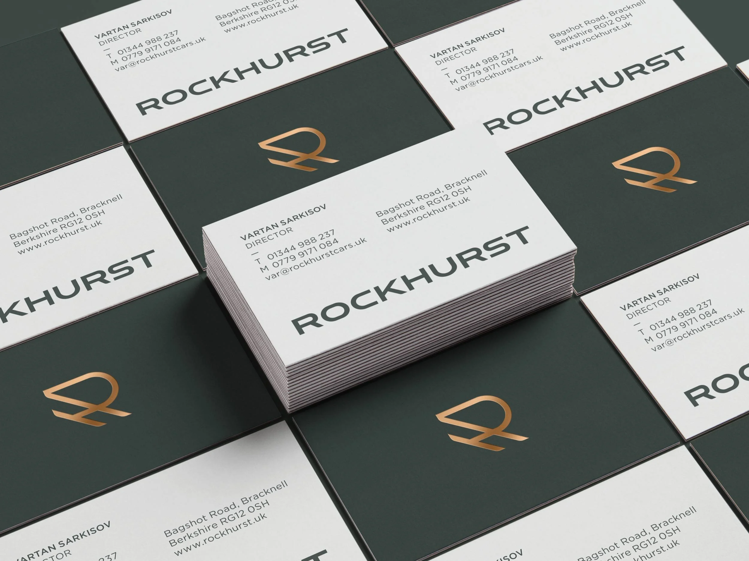
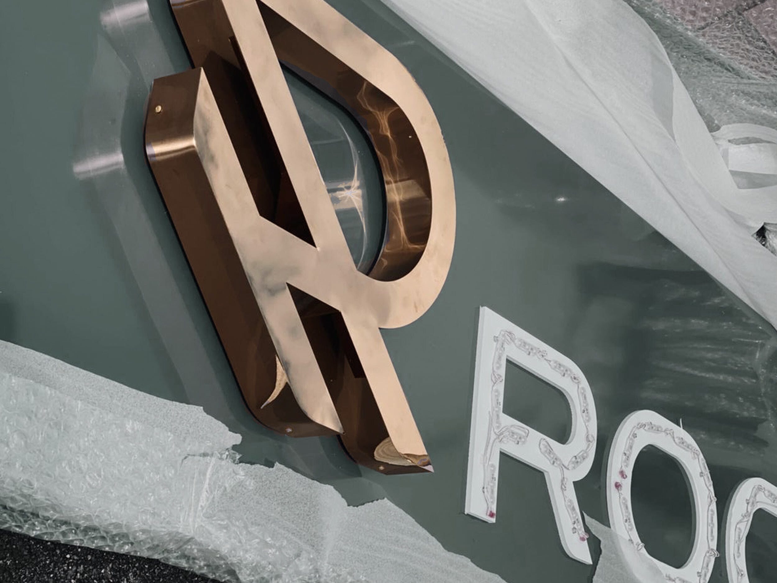
Working with a strategic branding partner, together we undertook market research, developed a name, a brand platform, key messaging, the visual identity, brand guidelines, stationery, environmental graphics, signage and bespoke prints for the showroom.
The diagonal lines of the ‘RH’ monogram were designed to represent speed (a nod to ‘petrolhead passion’), whilst the occasional use of a serif typeface helped to ground the brand and convey its reassuring professionalism. The masculine colour palette of army green and copper was chosen for its premium feel without appearing too luxurious, alongside a touch of lime which – when used sparingly – provided an unexpected injection of enthusiasm.
Customised imagery of epic open roads depicted the driving experience and echoed the brand essence (‘the drivers’ choice’). Using black & white brand imagery helped to distinguish it from the coloured car photography. An illustration style was also developed, taking the lines from the monogram and being used to reflect these epic journeys. A checkered pattern reminiscent of a racing flag (or a tyre tread), mirrors the curves of the logo and was introduced for decorative purposes - particularly within the showroom.
The brand has been very well received and resonates well with the client’s audiences, as this new start-up continues to go from strength to strength.
What the client says
“Completing the task ahead of a clearly established timetable & budget, we’ve received the utmost attention to detail with eagerness & professionalism – accommodating us even at odd hours of the day. Working closely together towards the final result, has provided the team at Rockhurst with insight into different dimensions & a thorough understanding of the brand.
Thank you Jenny & the team!”
— Vartan S, Founder of Rockhurst


