Connection Capital
A brand refresh for a private equity company that provides individual investors with access to alternative investment opportunities — previously only accessible to institutional funds.


Brief:
Connection Capital provides access to alternative investment opportunities to a vetted audience of high net worth individuals and family offices. The opportunities they carefully curate for their clients are not readily available by any other means. They are usually targeted at institutional sources of capital and would normally require a minimum investment of at least £1m and often much higher.
The company needed to refresh their brand in order to better convey both their experience, and their rather enterprising client-focussed business model.
Solution:
Connection Capital is a client of Incorporate Design – a London based creative branding agency. Working as part of their creative team, together we created a brand platform, key messaging, and a new visual identity.
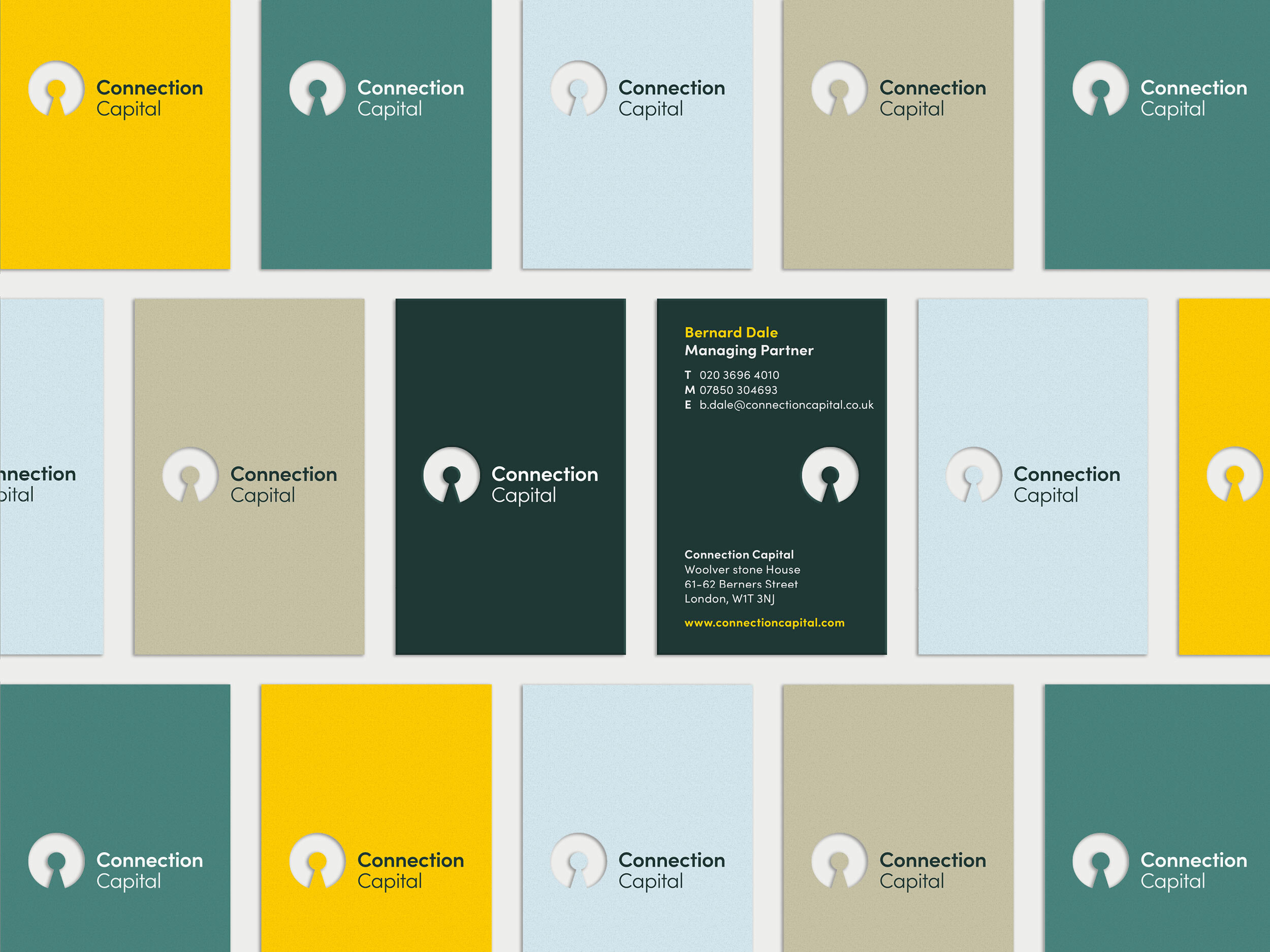
This logo symbol has a hidden gem – a key hole in the middle of a letter C. It conveys the theme of ‘access’ in a subtle way, and also produces a bold and confident mark. It is also possible to see a person at the centre of the symbol, which reflects the company's client-focussed approach.
A custom pattern was created to build upon the logo symbol and brand idea of ‘access’. The pattern was inspired by the idea of turning a key in a lock. With certain rotations two key holes can meet to create an interesting connection in the negative space. This symbolises the relationship between syndicate investors and opportunities.
A primary palette of racing green and pale grey was selected to communicate trust, whilst also appealing to a HNW audience. The application of paler neutral colours, alongside more confident bolder colours, resulted in a very contemporary looking brand. The vibrant yellow reflects the enterprising spirit of the company.
The image style builds on the core brand idea – access. It is about being on either side of the keyhole. For one audience (investors) its about gaining access to opportunities that were previously denied to them. For investees, the symbol changes the background image in some way – its about what accepting investment from Connection Capital can add to their business both in terms of capital and expertise.