Scott Dunn
Designing a consistent, aligned suite of marketing materials for a premium travel company.


Brand expression
Design for Print
Communications
Scott Dunn is a luxury tour operator creating tailor-made holidays and honeymoons to amazing destinations all over the world, voted Favourite Specialist Tour Operator by the readers of Conde Nast Traveller. Every year, their travel consultants seek out the best properties and fine-tune their local knowledge so they can craft holidays around each client. As well as creating bespoke experiences.
The challenge the company faced at the start of the project was how to convey their premium service and create a distinct look & feel for their marketing collateral, in order to set them apart.
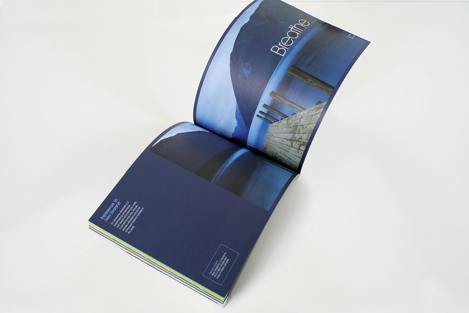
Working with London based agency Ideas Factory, together we redesigned the entire suite of sales brochures as a whole, refining both the covers and the interiors to create an aligned and distinctive appearance. The covers featured bespoke photography, which beautifully showcased hand-selected objects from each particular region. The covers were then printed using a sophisticated finishing treatment, which produced a gloriously rich black tone on shimmering pearlescent paper. This thoughtful consideration of print finishing techniques helps to convey the impression of quality service and a premium brand.
The brochure interiors used a versatile design grid, prominent typography and inspiring photography to capture the unique feel of each location, whilst also retaining a sense of belonging to the brochure suite as a whole.