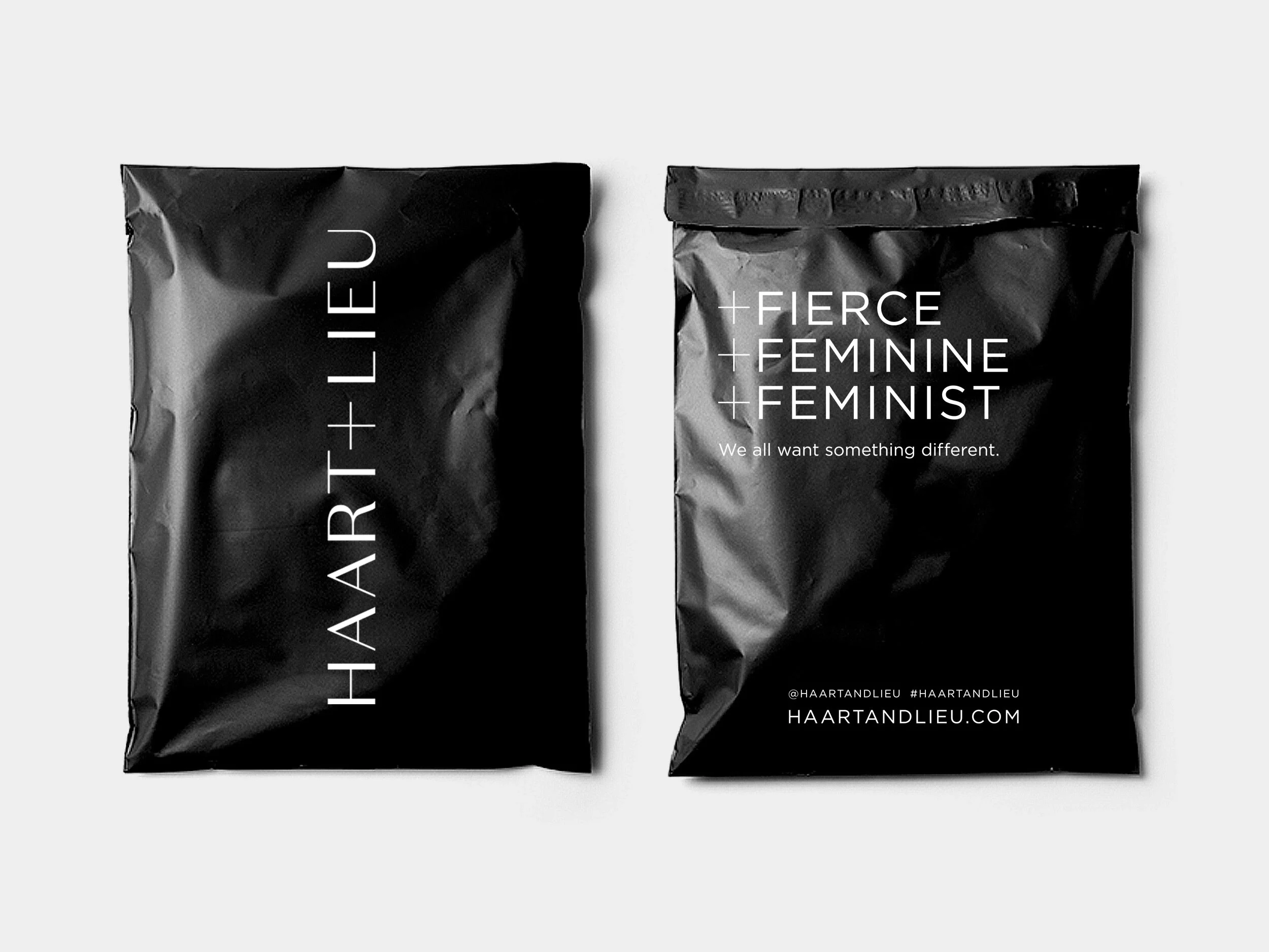
Haart+Lieu
A positive new fashion brand reshaping the world of shapewear with an entirely new product that’s designed to be seen.

Logo design
Visual identity
Brand guidelines
Design for Print
Brief:
HAART+LIEU are reshaping the world of shapewear with +BODY, an entirely new category of luxury shapewear that’s designed to be seen.
+BODY amplifies a woman’s best asset: her confidence. Fusing beauty and utility to transform shapewear into coveted pieces women are proud to wear. The fashion-forward collection features colour and pattern, which empowers women to feel sexy and confident about showing off their shapewear.
The design challenge was to create a positive fashion brand that would launch with an endorsed sub-brand of luxury shapewear. The brand had to be empowering to women and exude confidence. It needed to convey product innovation in addition to appearing sexy and beautiful.
Solution:
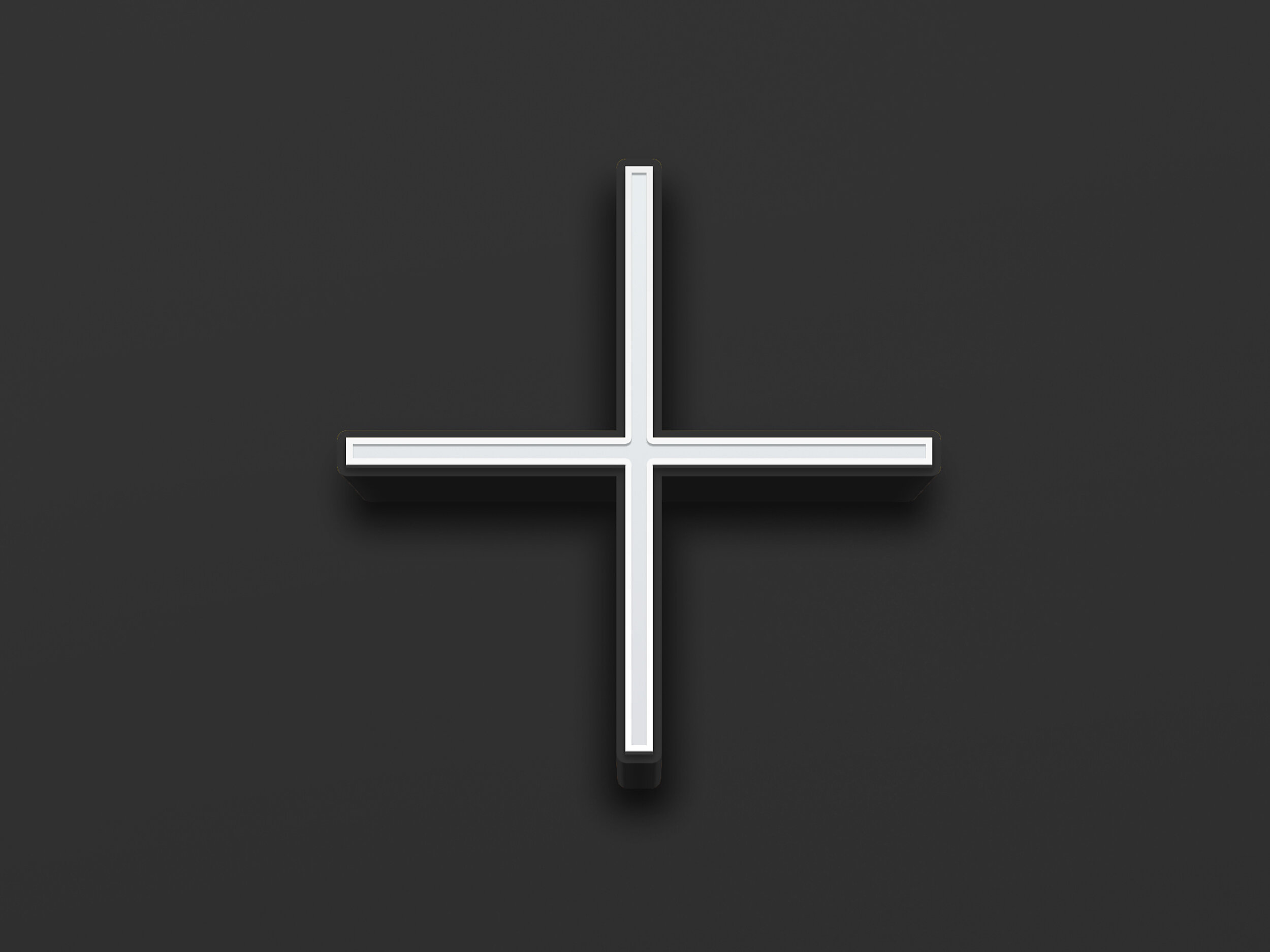
The solution was to develop the plus sign as an integral part of the graphic brand idea, and to embed it within the HAART+LIEU logo, as opposed to using an ampersand. The plus then became a naming device for sub-branding i.e. +BODY. The plus refers to the brand's positivity and shapewear innovation. It can be used as a stand-alone icon as well as being amplified in messaging: +STYLE, +BEAUTY, +COMFORT etc.
The palette was restricted to black & white to allow the +BODY product colours to contrast well with it. An elegant typeface captured the femininity of the brand, whilst the uppercase letters projected confidence.