Rockhurst
Branding a supercar dealership where precision engineering meets understated trust.


About the project
Client:
Rockhurst
Sector:
Automotive
What I designed:
• Logo design
• Visual identity
• Illustration
• Brand guidelines
• Brand expression
• Printed communications
• Social media assets
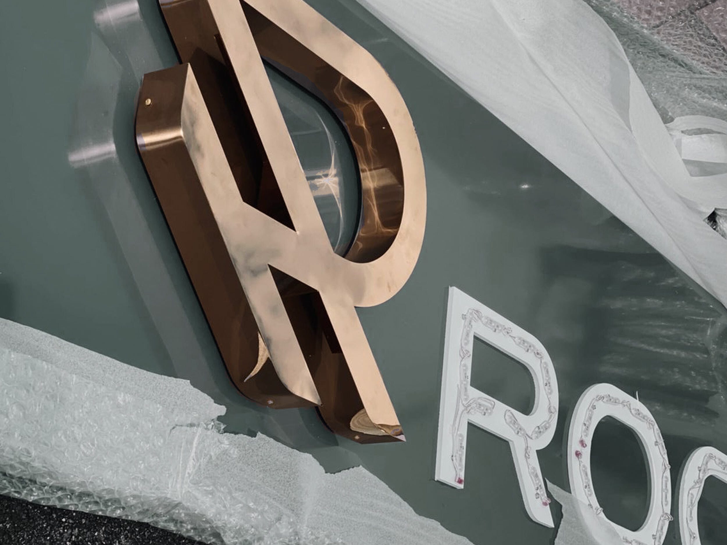
• Signage
• Interior Graphics
-
Rockhurst curates a highly selective range of rare and bespoke performance vehicles, with an emphasis on technical excellence and driver experience.
In a market that often favours flash over substance, Rockhurst offers something different: a calm, courteous, and knowledgeable approach for discerning clients who value service, specification, and long-term relationships. -
To create a brand identity that communicates trust, technical expertise and professionalism—without leaning too heavily into traditional luxury cues. The brand needed to feel confident, precise and quietly premium.
-
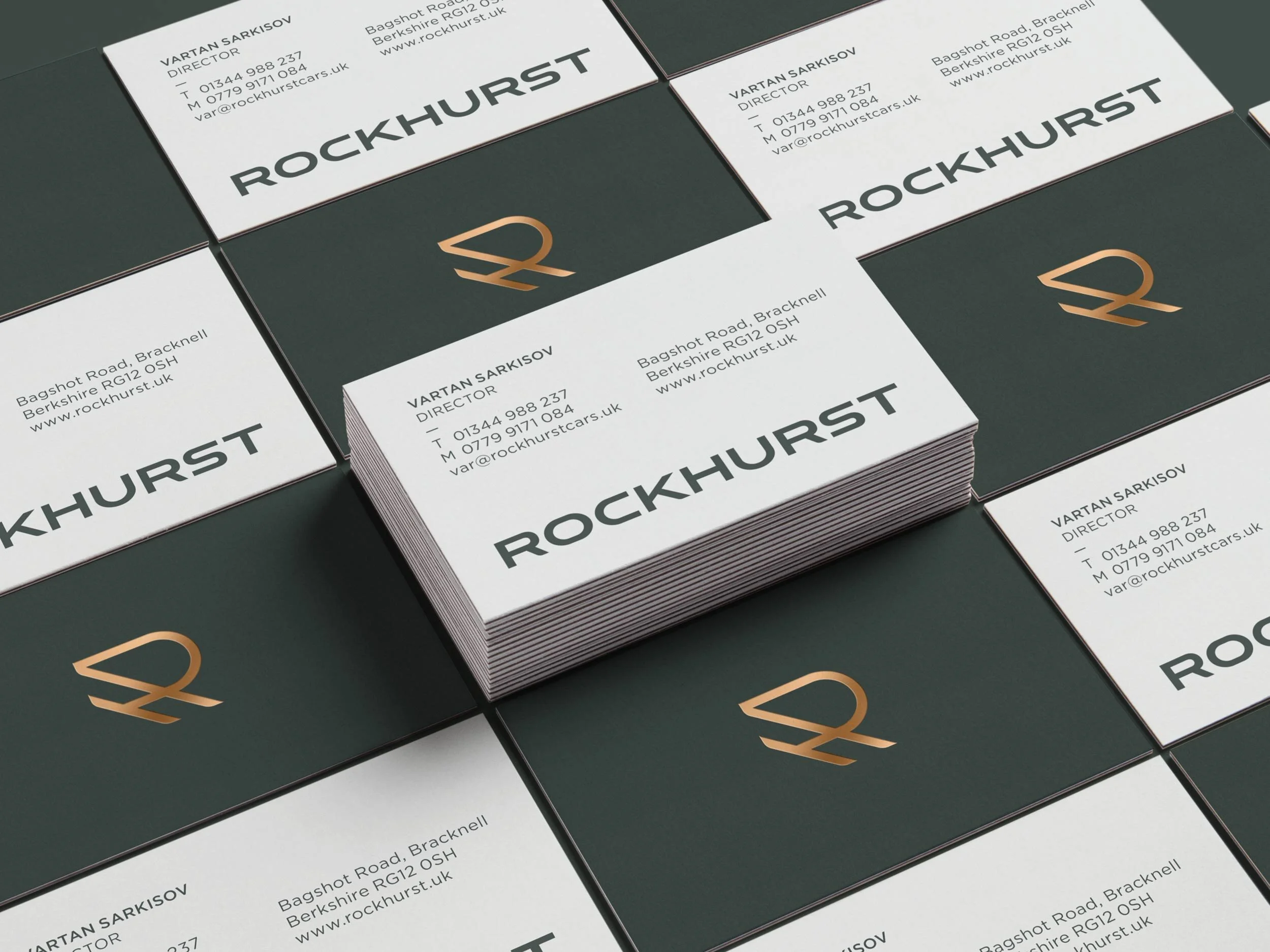
Partnering with a strategic branding consultant, we began by immersing ourselves in the world of high-performance automotive retail. Together, we developed the name, brand platform, messaging and full visual identity—from monogram to showroom.
Design elements were built around a clean, angled ‘RH’ monogram symbolising motion and performance. A grounded serif typeface and a masculine colour palette—deep green, copper, and a sharp lime accent—conveyed authority with energy. Custom road imagery and graphic illustrations extended the brand language across showroom materials.
-
The new identity positions Rockhurst as a trusted, high-end dealership with a clear point of view. It has resonated strongly with their audience and helped establish a credible brand presence in a competitive market.
Client perspective

“Completing the task ahead of a clearly established timetable & budget, we’ve received the utmost attention to detail with eagerness & professionalism – accommodating us even at odd hours of the day. Working closely together towards the final result, has provided the team at Rockhurst with insight into different dimensions & a thorough understanding of the brand.
Thank you Jenny & the team!”
— Vartan S, Founder of Rockhurst