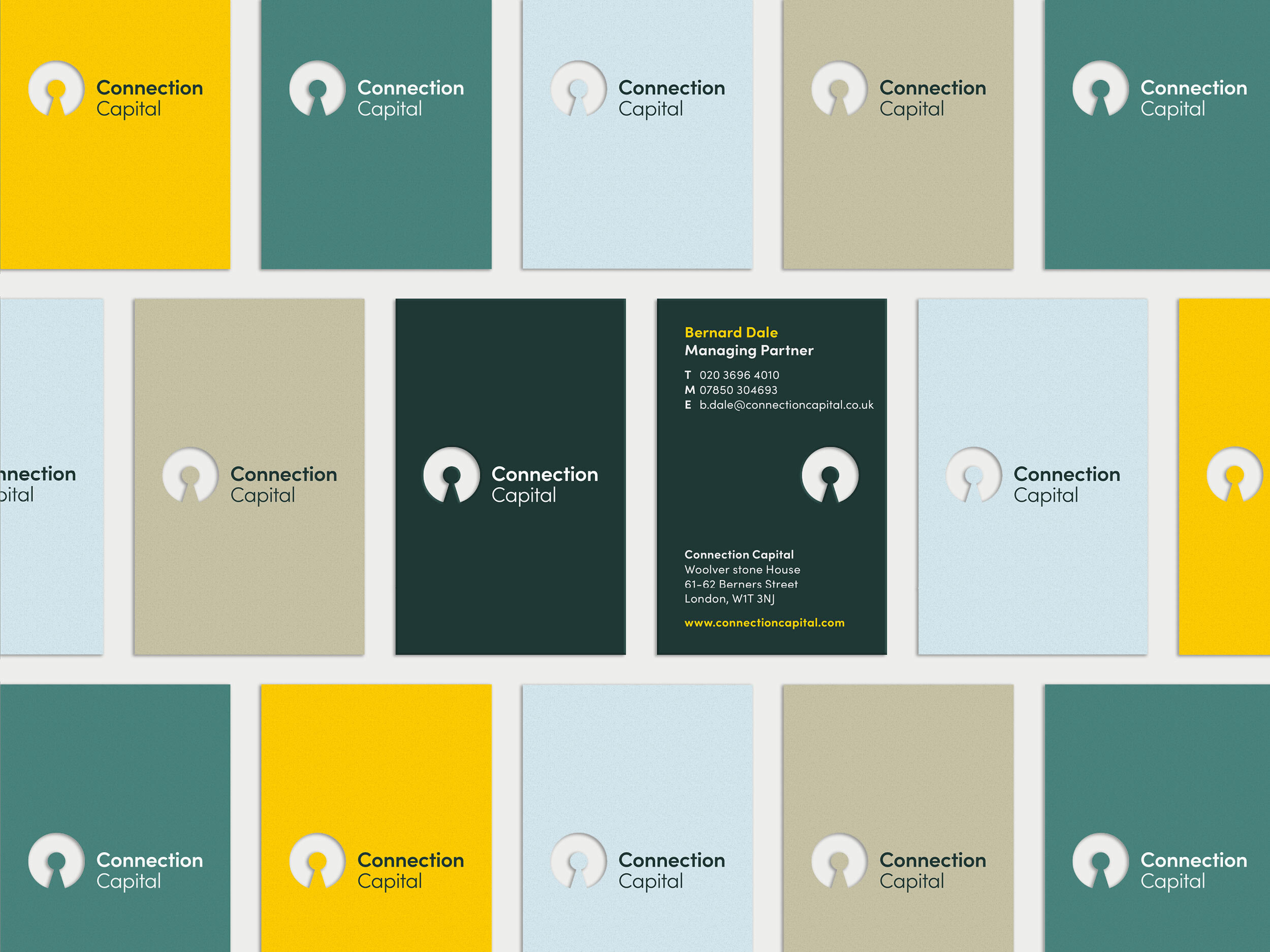
Connection Capital
Democratising private equity with a brand that says: this door doesn’t open for just anyone.
About the project
Client:
Connection Capital
Sector:
Financial Services,
Private Equity
What I designed:
• Logo design
• Visual identity
• Brand expression
-
Connection Capital is a private equity firm offering exclusive alternative investment opportunities to high-net-worth individuals and family offices. Their curated deals are typically reserved for institutional investors, making their offer both rare and compelling.
-
To modernise the brand to better reflect Connection Capital’s client-focused approach, established expertise, and enterprising spirit—while visually conveying the idea of privileged access.
-
Connection Capital is a client of Incorporate Design, a London-based strategic branding agency. While they led on brand strategy and messaging, I was responsible for all aspects of the visual identity design.
The logo features a stylised ‘C’ with a keyhole at its centre—subtly representing access and putting the client at the heart of the brand. A custom pattern was built from this shape, symbolising investor-opportunity connections. The colour palette blended institutional trust (racing green and grey) with bold highlights like yellow to convey innovation and ambition. The imagery reinforced the concept of access—showing both perspectives: the investor gaining entry, and the investee unlocking new potential. -
The refreshed brand positions Connection Capital as a credible, forward-thinking firm with a clear point of difference. It appeals to their high-net-worth audience while expressing the exclusivity and value of their investment offer.


