HAART+LIEU
Shapewear that’s made to be seen. A brand that refuses to hide.
About the project
Client:
HAART+LIEU
Sector:
Fashion
What I designed:
• Logo design
• Visual identity
• Brand guidelines
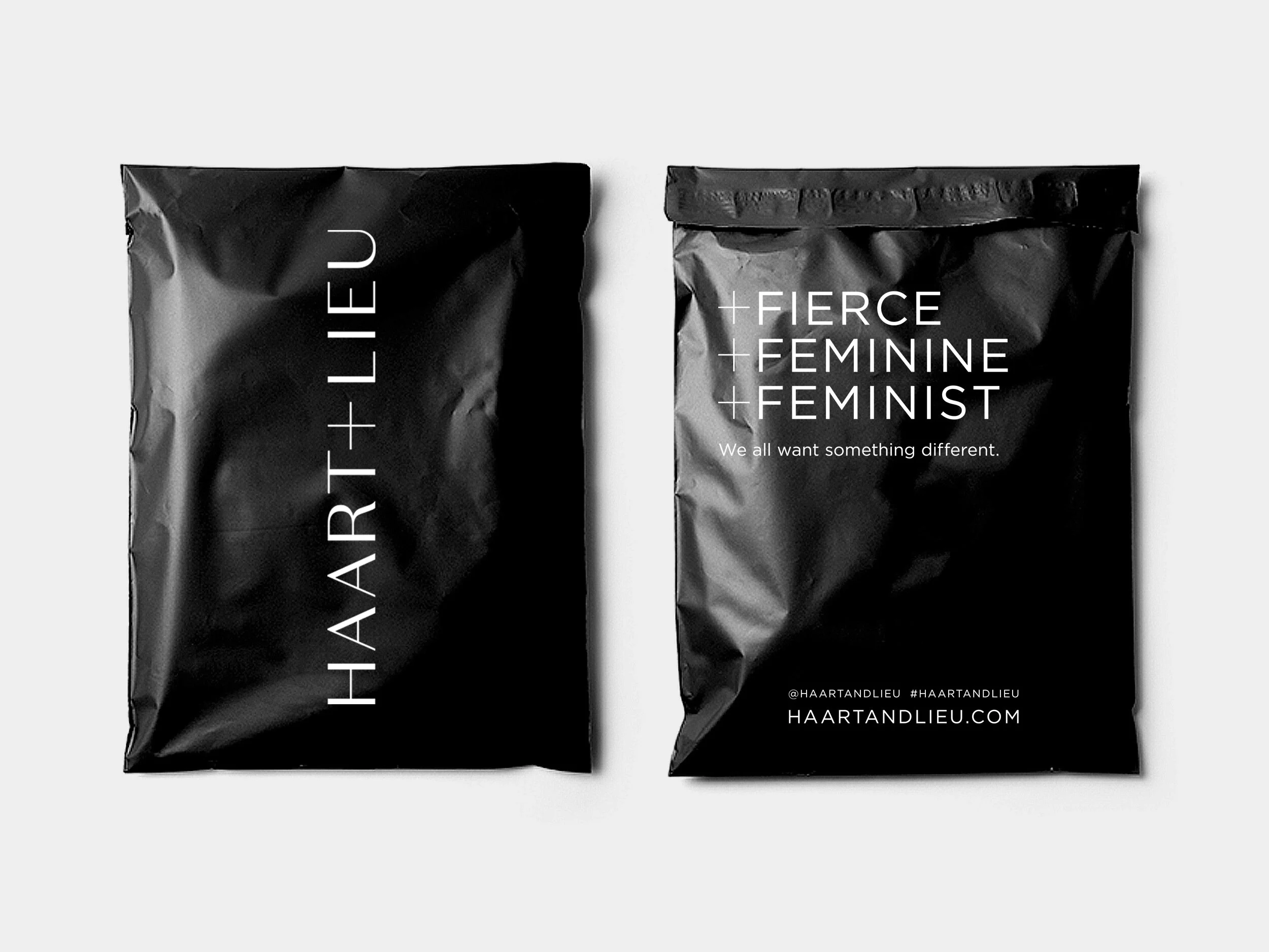
• Printed communications
-
HAART+LIEU is a new fashion brand redefining shapewear with +BODY—an innovative product line designed to be seen. Fusing beauty, utility and bold self-expression, their launch collection celebrates body confidence and repositions shapewear as fashion.
-
To create a brand identity that felt empowering, stylish and bold—supporting the launch of +BODY as a disruptive sub-brand. The challenge was to communicate both fashion credibility and product innovation, while appealing to a confident, modern female audience.
-
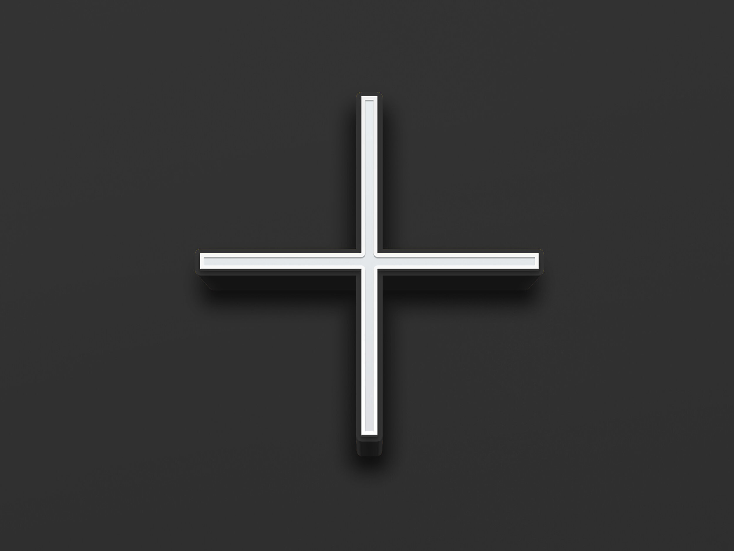
The graphic idea centred on the plus symbol, used in place of the ampersand in the HAART+LIEU logo - the parent brand. It became a defining brand asset—representing positivity, product innovation and a flexible naming system for future extensions (+BODY, +STYLE, +COMFORT, etc). A minimal black-and-white palette ensured the colourful +BODY products stood out, while a refined typeface brought femininity and the uppercase styling added strength and presence.
-
The brand launched with a bold, clear identity that stands apart in the shapewear market. It has established a confident platform for product storytelling and future expansion.


